
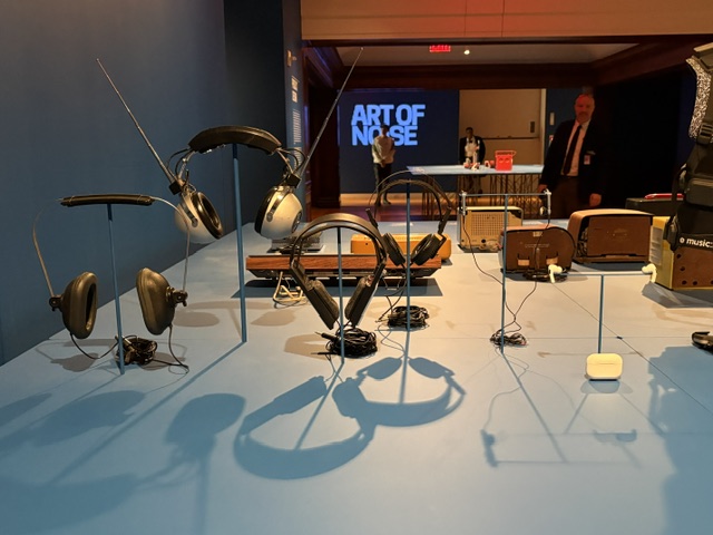
Art of Noise at the Cooper Hewitt. (Photo: Noa Russo for Fine Art Globe)
Since my first concert, I’ve been entranced by the way visuals shape the way music is experienced. In college, I enrolled in a course titled History of Graphic Design, where a lecture on album covers and concert fliers completely captivated me and deepened my appreciation for the designers responsible for music’s iconic imagery. For instance, I learned that Milton Glaser (the same designer behind the I Heart NY logo) created Bob Dylan’s 1967 Greatest Hits album cover, and Klaus Voormann illustrated The Beatles’ Revolver.

The designer Milton Glaser, pictured in front of his iconic drawing of Bob Dylan, from a 2016 appearance at the Cooper Hewitt. Glaser passed away on June 26, 2020. (Photo: Cooper Hewitt).
So, when I heard about The Art of Noise at Cooper Hewitt, I knew it was an exhibition I couldn’t miss. First organized by the San Francisco Museum of Modern Art (SFMOMA), the show was updated to showcase the history of New York’s music scene for its East Coast debut (Hey Ho Let’s Go!). On view through August 16, The Art of Noise thoughtfully explores how graphic and product design have shaped how we have listened to music over the last century, making a compelling case that within the history of music also lies a history of design.
WHAT: Art of Noise
WHEN: Now through August 16, 2026
WHERE: Cooper Hewitt, 2 E 91st St, New York, NY
Before entering the exhibition’s main galleries, visitors are greeted by David Turnbull’s HiFi Pursuit Listening Room Dream No. 3, installed inside a room that used to be Andrew Carnegie’s private library. The listening room is completely immersive, inviting its audience to slow down, sit, and appreciate music with full attention that feels so rare. It was as if sound was on display, creating an opportunity to experience sound itself as something worthy of the same attention we typically reserve for visual art. Listening is placed at the forefront, and music is reframed as something to be experienced with care.
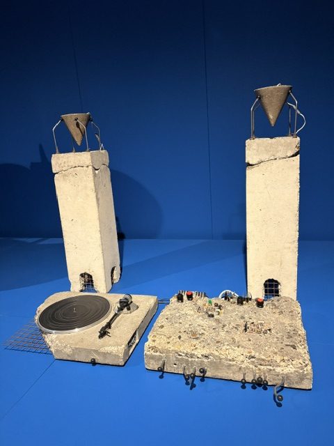
Art of Noise at the Cooper Hewitt. (Photo: Noa Russo for Fine Art Globe).
HiFi Pursuit Listening Room Dream No. 3 is an exciting introduction to the rest of the exhibition, which is divided into two sections: product design and graphic design. Product design is focused on product and industrial design, showcasing the evolution of audio equipment, including speakers, turntables, stereos, headphones, and countless other listening devices. While industrial design isn’t typically where my interests lie, I found myself appreciating the deliberately weighed design decisions behind these objects. I was confronted with how convenient it is to overlook the designers and sound engineers whose innovations fundamentally changed the way generations experienced music. For visitors who lived through these technological shifts, this collection of ephemera will be a fun trip down memory lane.
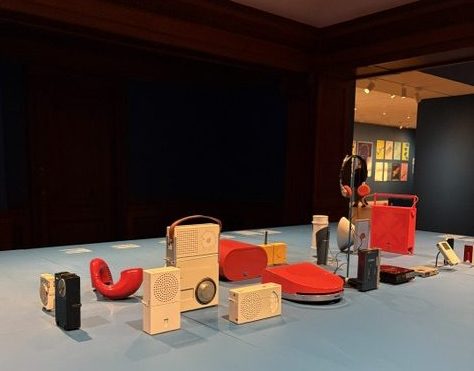
Art of Noise at the Cooper Hewitt. (Photo: Noa Russo for Fine Art Globe).
In addition to surveying the evolution of listening technology, the Product Design section also included some whimsical or exceptionally designed objects, blurring the lines between consumer electronics and sculpture. One standout is Wendell Castle’s Stereo Chest (1973), a handcrafted walnut cabinet that conceals a fully functioning stereo system behind elegantly carved doors, shaped like a peanut. Rather than treating audio equipment as something to conceal, Castle elevates it into a statement piece. Furniture, craftsmanship, and technology coexist in a single object, transforming an everyday appliance into an object of beauty.
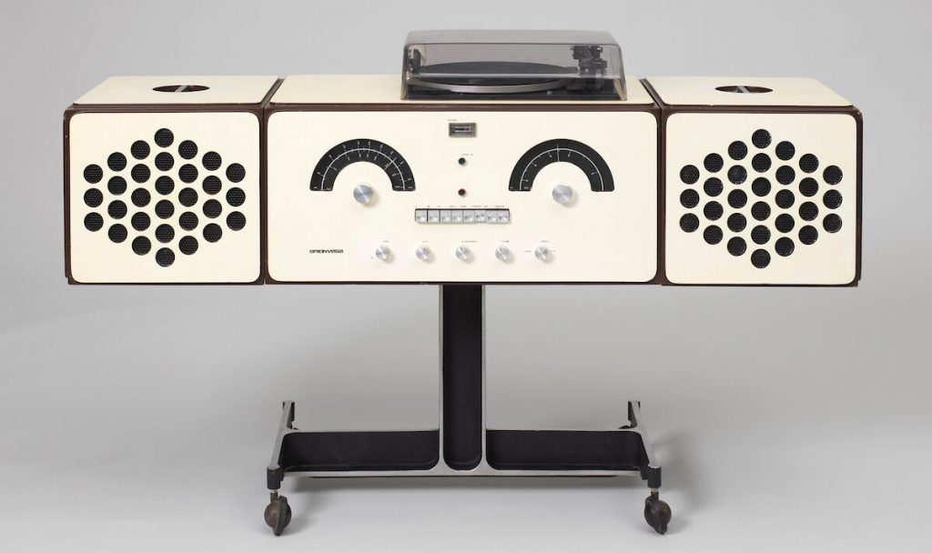
Art of Noise at the Cooper Hewitt. (Photo: Cooper Hewitt).
Next to Stereo Chest sits Ron Arad’s Concrete Stereo (1986), offering a striking counterpoint. Cast entirely in raw concrete, the stereo abandons Castle’s warmth in favor of an intentionally brutal, industrial aesthetic. Its heavy, architectural form challenges conventional ideas of what consumer electronics should look and feel like. It reminded me of Brick, the trending device that you can attach to your phone to give it the weight and feel or an actual brick, designed to curb phone use. Together, the two works illustrate how designers approached the same problem from radically different perspectives: one embraces the beauty of organic materials and while the other celebrates the permanence of industrial design. Displayed together, Castle’s and Arad’s works reinforce one of the exhibition’s central ideas: our relationship with music has always been shaped not only by sound itself, but also by the objects through which we hear it.
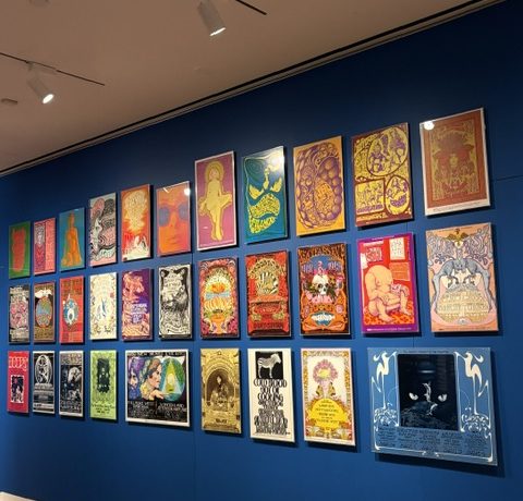
Art of Noise at the Cooper Hewitt. (Photo: Noa Russo for Fine Art Globe).
As an admirer of good graphic design, the other half of the exhibition is what stuck with me most. This gallery is filled with album covers, concert posters, and promo flyers, displayed salon-style. Deep blue walls anchor the space while hundreds of artworks compete for visitors’ attention. The sheer quantity of things creates the same exhilarating thrill as flipping through bins at a record store or walking into a dive-y venue plastered floor to ceiling with posters.

Art of Noise originated in San Francisco, and the influence of that city’s vibrant psychedelic art can be felt at the updated NYC version appearing at Cooper Hewitt. One can almost hear ‘Sugar Magnolia’ resonating from these great posters. (Photo: Noa Russo for Fine Art Globe).
I found myself lingering in front of psychedelic concert posters from the 1960s and ’70s, many advertising performances by artists like the Grateful Dead. I was glad to recognize posters my mom has and album covers my dad has stacked in our living room. This familiarity made the experience unexpectedly personal. Seeing these iconic graphics in a museum context reinforced just how influential they have become. What were once promotional materials have evolved into cultural artifacts.
The exhibition also highlights more familiar moments in visual culture from more recent generations. As a Gen Zer, I couldn’t help smiling when I came across imagery recalling Apple’s iconic iPod advertising campaign, with its silhouetted dancers and unmistakable white wired headphones. A campaign from my childhood that I recognized instantly emphasized how design can be just as culturally memorable as the music it promotes.
The Art of Noise encourages visitors to reconsider the role design plays in everyday life. Conversations about technology often prioritize function, but design has always been equally important in shaping what people remember, desire, and ultimately feel. The same is true of music. Album covers, posters, and even the objects we use to listen influence our relationship with the songs themselves. They create anticipation, build identity, evoke nostalgia, and ultimately shape the memories and associations we attach to music. The Art of Noise offers a compelling reminder that some of the most influential designs in our lives aren’t just things we look at but the things we listen through.
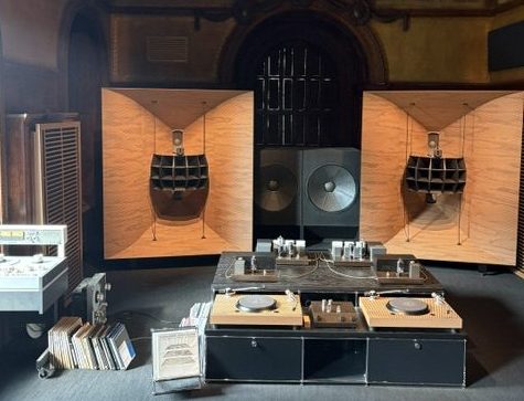
Art of Noise at the Cooper Hewitt. (Photo: Noa Russo for Fine Art Globe).


0 Comments